
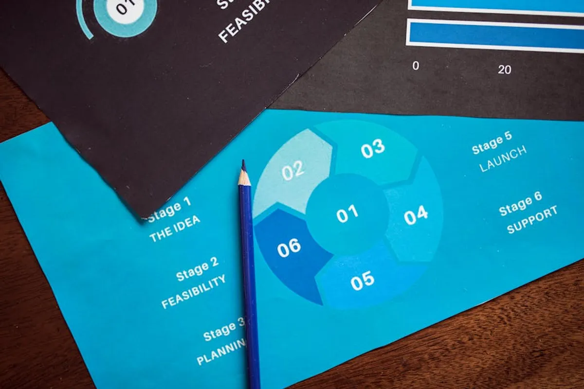
Infographics serve as a potent communication asset for marketers, content strategists, and educators aiming to distill complex information into digestible, visually engaging formats. Their core utility lies in transforming raw data, intricate processes, or abstract concepts into a compelling visual narrative that enhances comprehension and retention. For businesses, this translates directly to improved audience engagement, clearer product explanations, and more effective content distribution. Understanding what constitutes an effective infographic, beyond mere aesthetics, is crucial for leveraging its commercial potential in content marketing, lead generation, and brand authority building.
Defining the Effective Infographic
An infographic is a visual representation of information, data, or knowledge intended to present complex information quickly and clearly. Unlike simple charts or graphs, a true infographic combines data visualization, illustrations, text, and design elements to tell a coherent story or explain a concept. Its effectiveness hinges on several key attributes:
- Visual Narrative Structure: An effective infographic guides the viewer through information logically, using visual cues like arrows, numbering, or a distinct flow to maintain engagement and ensure clarity of message.
- Data Accuracy and Sourcing: All statistics, facts, and figures presented must be accurate and, where appropriate, clearly sourced. Credibility is paramount for an infographic to be trusted and shared.
- Clarity and Conciseness: While visually rich, an infographic should avoid clutter. Every element—text, icon, chart—must serve a purpose in conveying the message efficiently. Overloading an infographic with too much detail or extraneous visuals diminishes its impact.
- Target Audience Relevance: The design, language, and depth of information should align with the audience's existing knowledge and interests. An infographic for industry experts will differ significantly from one aimed at general consumers.
- Strategic Branding Integration: Subtle, consistent branding (logo, color palette, font) reinforces brand identity without overwhelming the content. The infographic should feel like an extension of the brand's communication strategy.
Core Infographic Design Principles
Successful infographic design extends beyond simply arranging data points. It involves a strategic application of visual principles to enhance understanding and memorability.
Visual Hierarchy and Flow
This principle dictates how the eye moves across the infographic. Larger, bolder elements naturally draw attention first. A well-designed infographic uses size, color contrast, and strategic placement to establish a clear order of information, ensuring the most critical data or conclusions are seen immediately, followed by supporting details.
Color Psychology and Palette Consistency
Color choices are not arbitrary. They evoke emotions, highlight distinctions, and establish brand identity. A limited, consistent color palette prevents visual chaos and reinforces the infographic's message. For instance, cool tones might convey stability, while warm tones suggest energy or urgency.
Typography for Readability and Emphasis
Selecting appropriate fonts and managing their size, weight, and style is critical. Headings require distinct fonts to stand out, while body text needs to be highly readable. Consistent typography across the infographic maintains a professional appearance and aids in information processing.
Strategic Use of White Space
Often overlooked, white space (or negative space) is the empty area around and between elements. It prevents visual fatigue, improves readability, and makes complex layouts feel less daunting. Adequate white space gives individual elements room to breathe and stand out.
Common Infographic Types and Their Creative Applications
Different types of infographics serve distinct communication goals, offering versatility for various content strategies.
Statistical Infographics
Best for: Showcasing research findings, survey results, or comparative data. These rely heavily on charts, graphs, and numerical data presented with visual flair.
Creative Use: A marketing agency could use a statistical infographic to present client campaign performance metrics, highlighting ROI and audience growth in a visually compelling report.
Informational Infographics
Best for: Explaining complex concepts, summaries, or overviews of a topic without heavy reliance on numerical data. They often feature icons and text blocks.
Creative Use: A software company might create an informational infographic to simplify the technical benefits of a new feature, making it accessible to non-technical users.
Timeline Infographics
Best for: Illustrating historical events, project phases, or the evolution of a product or industry over time. They emphasize chronological progression.
Creative Use: A brand celebrating an anniversary could use a timeline infographic to visually narrate its journey, key milestones, and product innovations over the decades.
Process Infographics
Best for: Breaking down a step-by-step procedure, a workflow, or how a system operates. They use sequential numbering, arrows, and distinct sections.
Creative Use: A B2B service provider could use a process infographic to explain their client onboarding journey, setting clear expectations and demonstrating efficiency.
Comparison Infographics
Best for: Highlighting differences and similarities between two or more items, services, or concepts. They often use side-by-side layouts or distinct sections for each item.
Creative Use: An e-commerce business might compare two product models, detailing features, benefits, and specifications to help customers make informed purchasing decisions.
Pro Tip: Before committing to a design, map out your infographic's core message and target audience. An infographic that tries to serve too many purposes or appeal to too broad an audience risks losing its focus and impact. Clarity of purpose ensures every design choice supports the central communication goal.
Maximizing Infographic Impact
Infographics are not merely visual aids; they are strategic content assets that, when properly deployed, can significantly contribute to commercial objectives.
- Content Marketing Engagement: Visually appealing content is 40 times more likely to be shared on social media than plain text. Infographics drive higher engagement rates, increasing reach and brand visibility.
- Backlink Acquisition: High-quality, data-rich infographics are frequently cited and linked to by other websites, contributing to a stronger backlink profile and improved search engine rankings.
- Lead Generation: Gated infographics, offering exclusive data or insights, can be powerful tools for capturing leads, especially in B2B contexts where detailed information is valued.
- Brand Authority: Consistently publishing well-researched, professionally designed infographics positions a brand as a thought leader and expert in its field.
- Internal Communication: Beyond external marketing, infographics can streamline internal communication, explaining complex company policies, project updates, or training materials more effectively to employees.
Developing Your Next Infographic
Creating an effective infographic involves a structured approach to ensure both visual appeal and informational accuracy.
Begin by clearly defining the infographic's primary objective and target audience. What specific message do you need to convey, and who needs to receive it?
Next, gather and verify all data, statistics, and facts. Ensure sources are credible and noted. An infographic's value is directly tied to the integrity of its information.
Outline the visual narrative. Sketch out how the information will flow, what charts or icons will represent specific data points, and where text blocks will provide context. This pre-design phase is critical for establishing a logical structure.
Proceed with design, either in-house or with a professional designer. Focus on applying the core design principles: hierarchy, color, typography, and white space. Ensure brand consistency.
Finally, plan your distribution and promotion strategy. Where will the infographic be published? How will it be shared across social media, email newsletters, or other channels? Consider creating different versions (e.g., smaller snippets for social media) to maximize reach.
Frequently Asked Questions
What distinguishes an infographic from a standard data visualization?
While all infographics contain data visualization, not all data visualizations are infographics. A standard data visualization might be a single chart or graph presenting specific data. An infographic, however, integrates multiple data points, visuals, and text into a cohesive, often narrative-driven, standalone piece designed to explain a broader concept or tell a complete story.
What is an ideal length for an infographic?
There is no universal "ideal" length; it depends on the complexity of the information and the target audience. Generally, infographics should be long enough to convey the message fully without becoming overwhelming. Many successful infographics are designed for vertical scrolling, allowing for detailed information without appearing cluttered. Focus on conciseness over arbitrary length targets.
How do infographics contribute to SEO?
Infographics enhance SEO primarily through increased engagement and backlink acquisition. Visually appealing content encourages longer dwell times on pages and higher social shares, signaling relevance to search engines. More importantly, high-quality infographics are frequently embedded and linked to by other sites, generating valuable backlinks that improve domain authority and search rankings.